
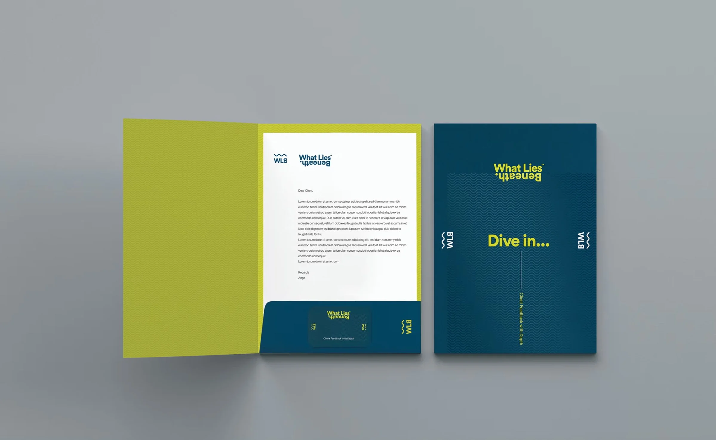
What Lies Beneath.
Working with What Lies Beneath, the aim was to create a brand that reflects the value of looking deeper — beyond surface-level feedback to uncover meaningful insight.
Beneath the surface.
The identity is built around the idea of depth — revealing what sits beneath the surface.
This thinking informed both the visual language and the way the brand presents itself, shifting between what’s visible and what’s hidden.

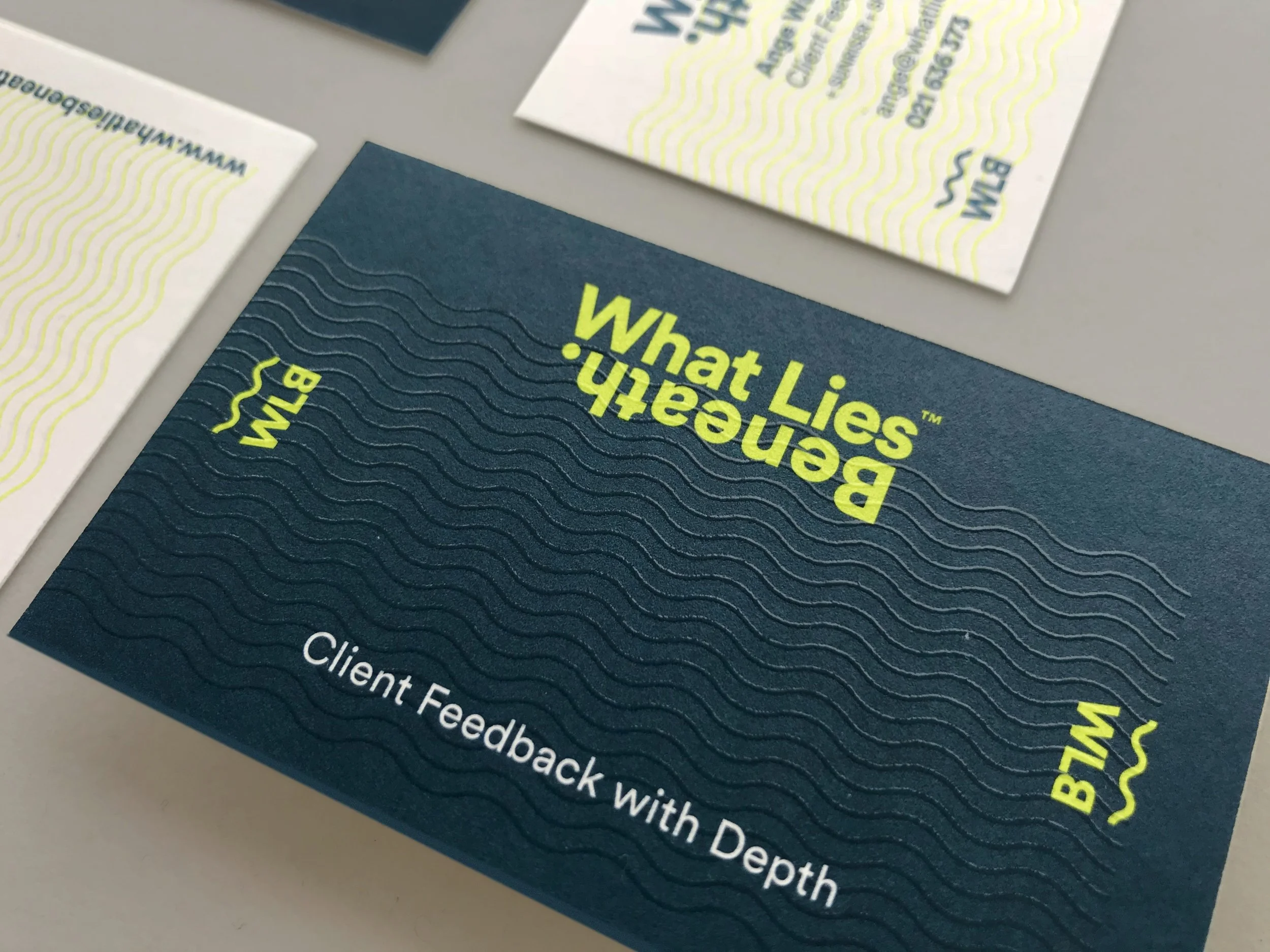
Layered insight.
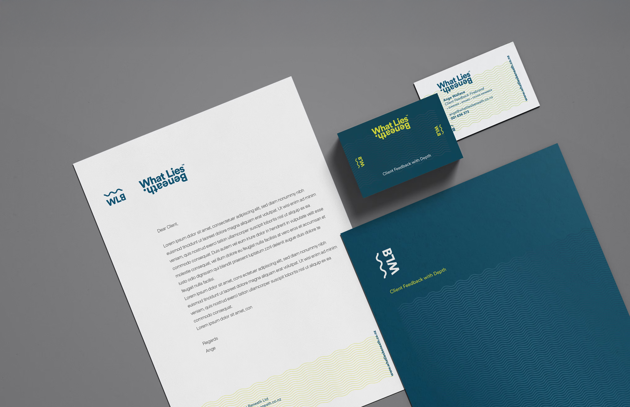
A simple visual system was developed using repeating wave forms — referencing both water and layered insight.
The device is used to frame content, create movement, and build consistency across applications.
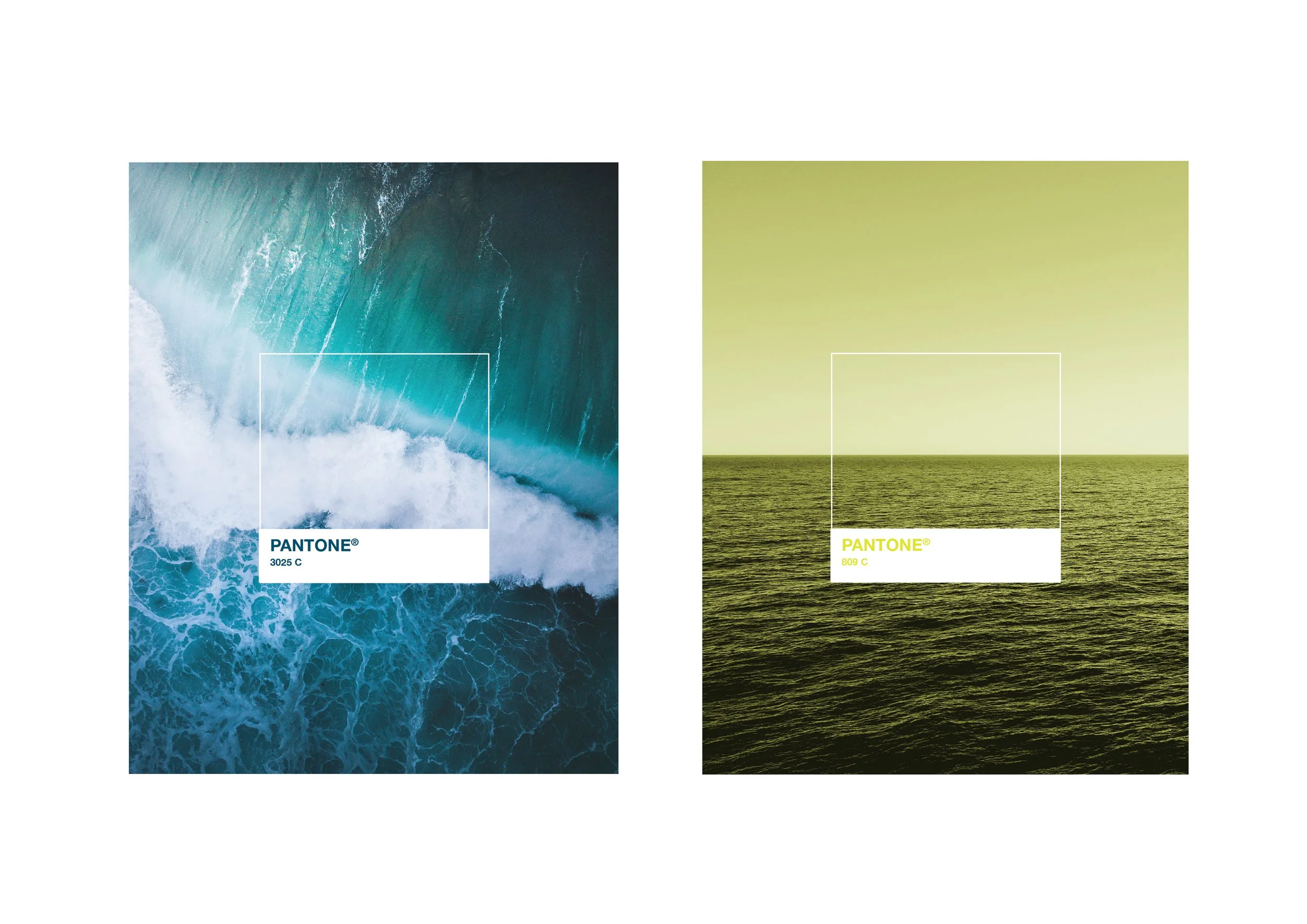
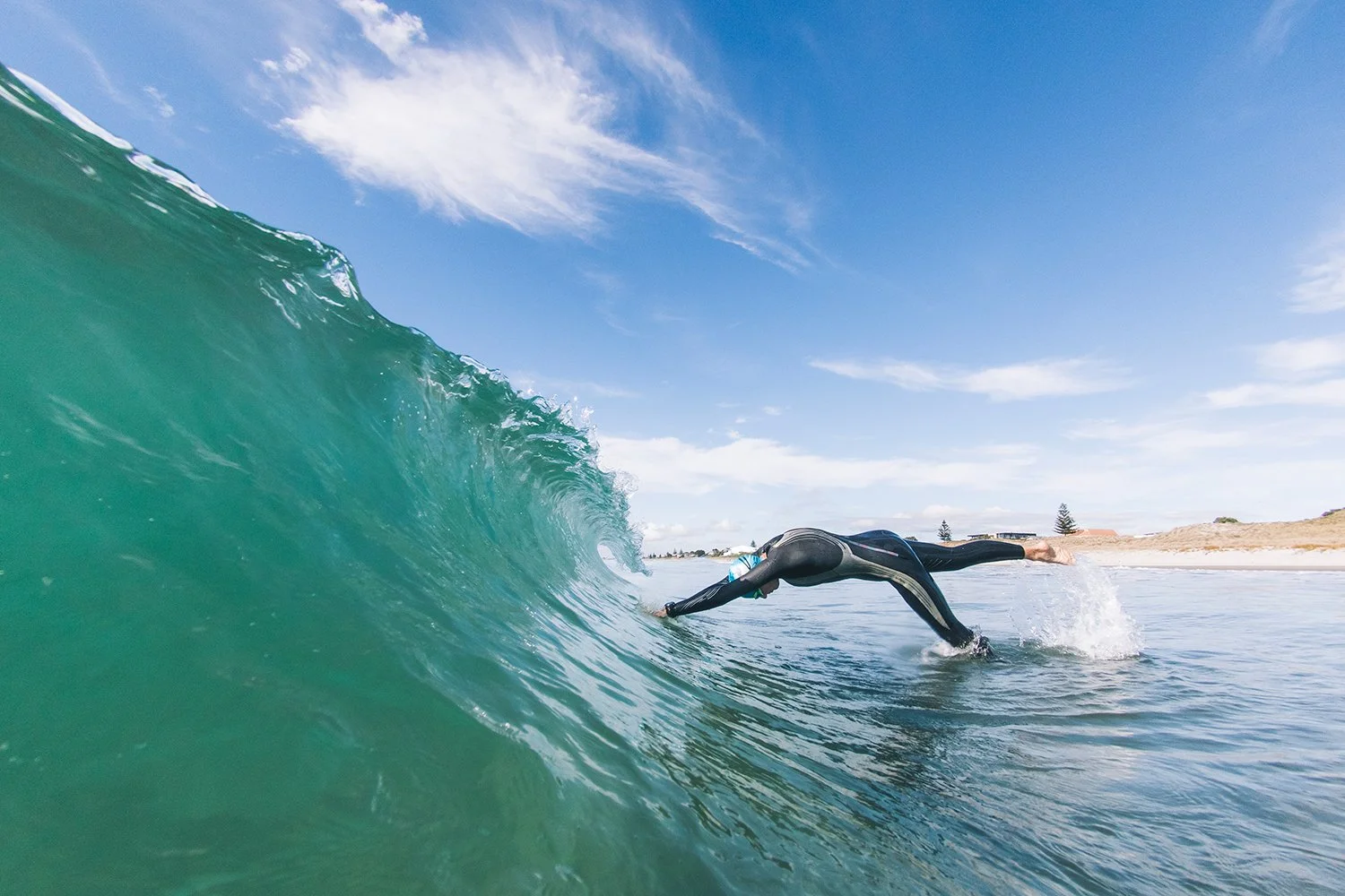
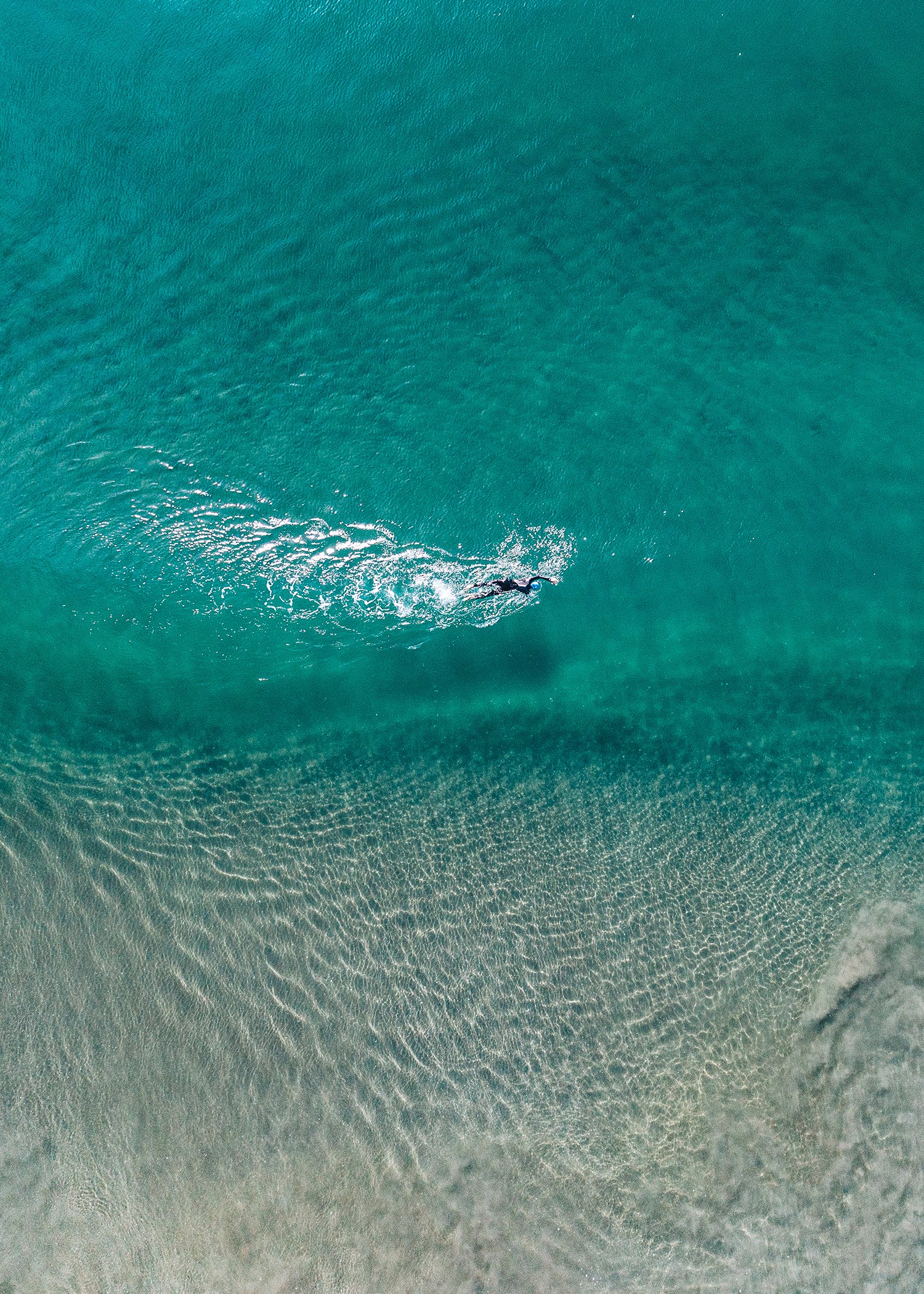
Inspired by the ocean.
A restrained palette of deep teal and high-contrast yellow creates a clear, recognisable presence.
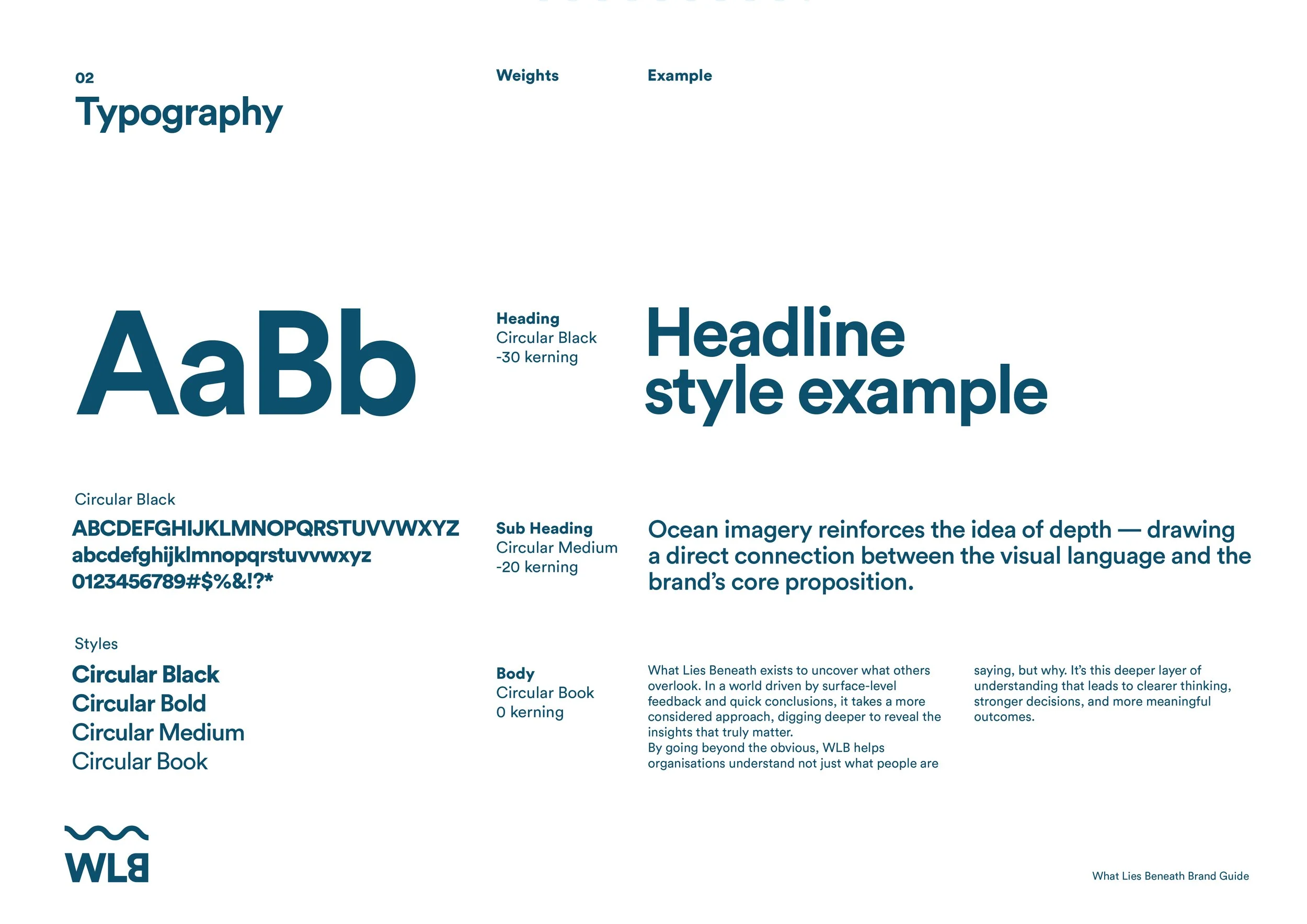
Ocean imagery reinforces the idea of depth — drawing a direct connection between the visual language and the brand’s core proposition.


The result is a more considered, ownable identity — giving
What Lies Beneath a clearer presence and a distinct point of difference.